D’Alishawn Grooms
ARTC 1359.82700
Thoughts
Tyrone Williams’s design is mostly asymmetrical but the colors correlate with each other. I like his work because of the colors he used in his design which he used a lot of color in his designs. The colors work together in the balance artwork which makes it eye appealing.
What I learned
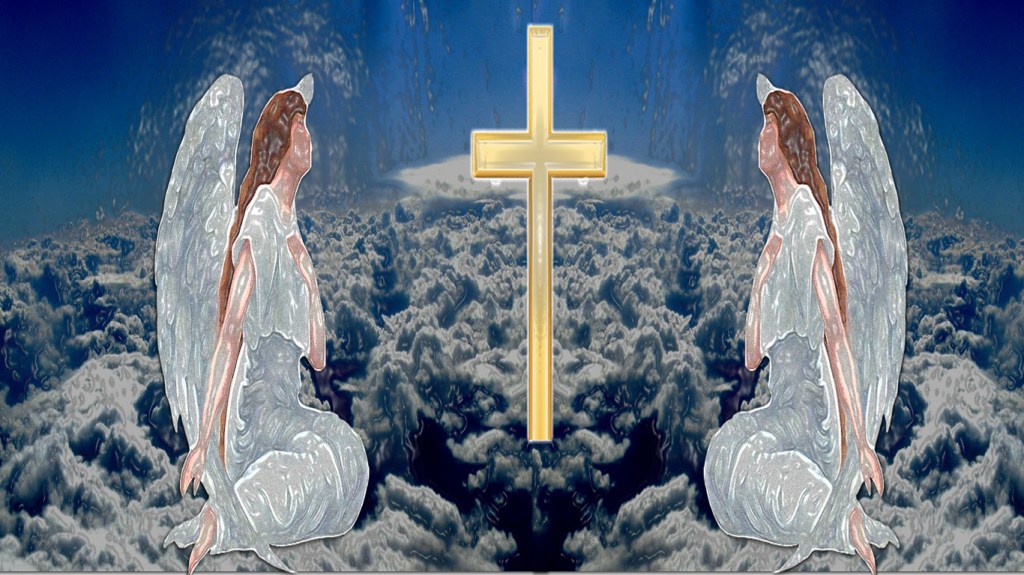
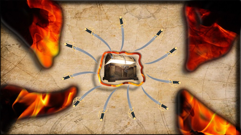
I learned that in balance artwork, it’s important to not have elements overpower each other. Overpowering can cause the artwork to appear dysfunctional. The exercise that was challenging was exercise 3. It was challenging because I wanted to be more creative and try something different with negative space. The pirate theme was what I was going for so I wanted the negative space to correlate with the radial balance.
Elements of design used to create balance.
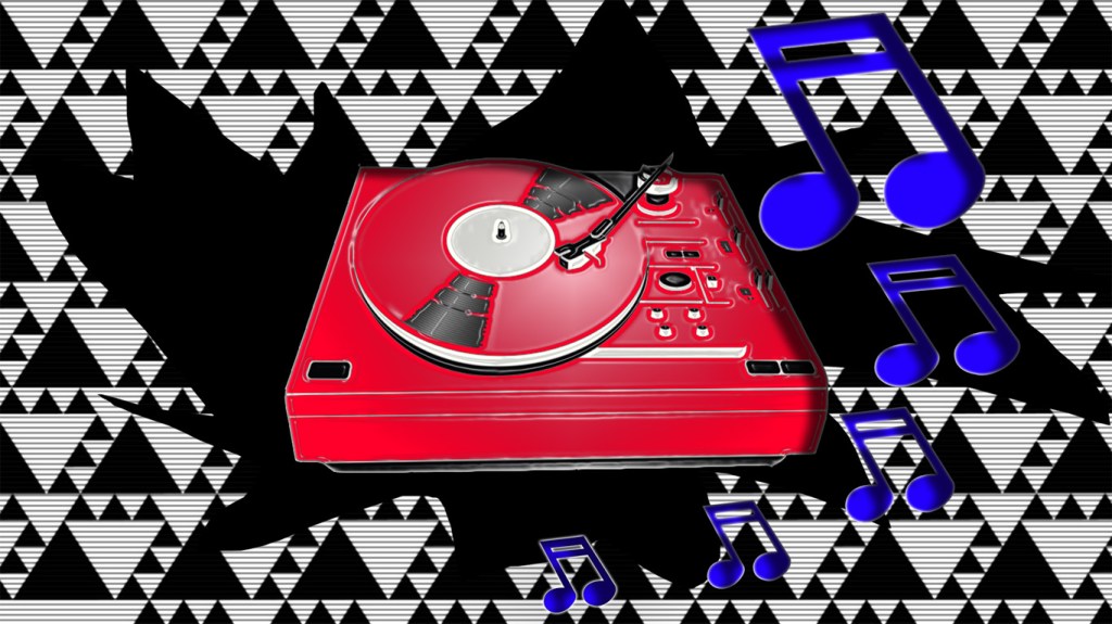
The elements I chose to use in the exercise are texture, patterns, and contrast. In exercise one, I used texture for the cloud background and the angels so that they correlate with each other. The background is darker and the angels are brighter giving that contrasting look. In exercise two I used a pattern in the background. In the third exercise, I used texture to create the burning of the paper.


