D’Alishawn Grooms
ARTC1359.82700
What I learned
I learned a lot about how colors work and how they complement each other whether the same color with different values or different colors overall. In exercise one, I learned how different color values work together so that they are not overpowering each other. The connection between the values made the artwork more appealing and not seem that the artwork was using one color value. In exercise two I learned that intensity can cause the color value to look darker/brighter or even faded. It has the power to make the hue of a color look completely different. In the third exercise I learned it is important to make sure that when using different colors, the colors are not close together in value. The artwork may appear to be different values of one color than different colors being used.
Favorite Color
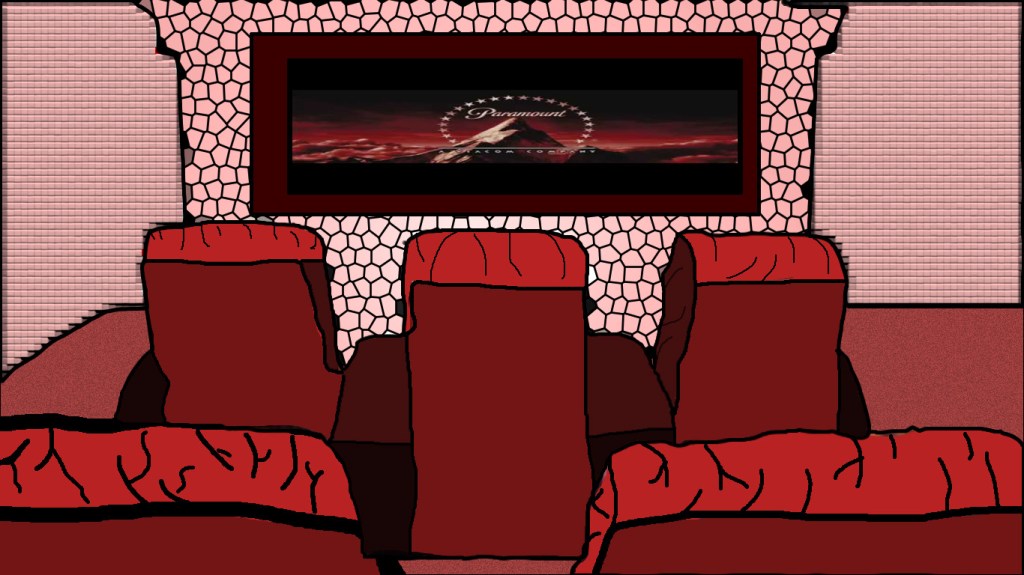
My favorite color is red because the color connects with my complex personality that I have. I can be loving, mean, or a feeling of being happy, and enthusiastic. Growing up I always like the color red especially if it was clothing, jewelry, accessories, etc.
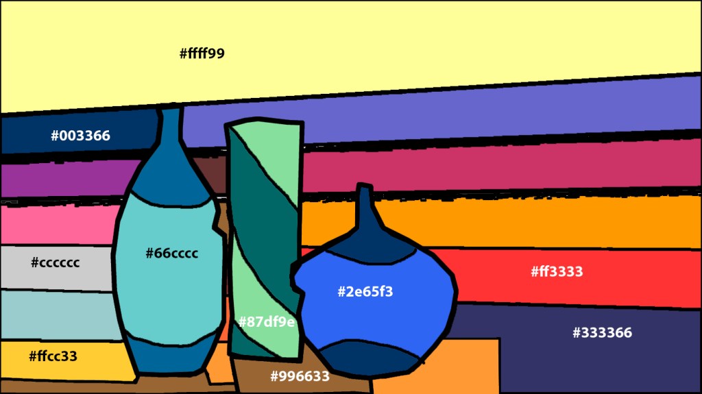
Still Life w/ Web- safe colors
The still life that I used for exercise 3 is a table with three vases. The challenge that I had using only web-safe colors is that it was hard to pick certain colors without changing the color. An example would be trying to use a red color but if I move the color picker a little bit then it will pick green. The shape focus that I wanted to use is the 3 vases and I wanted the different colors to have a connection between them.